
Interactive Finance Dashboard
Dynamic charts offer an easy way to view various Financial aspects of a Season and the Bookings associated to it.
Data Selections
Various selection options are available to tailor the data displayed in the charts. Change the Season, Booking Status, or Payment type from the drop down lists at the top of the screen.

Making any changes will refresh the charts instantly.

Charts Explained
PAYMENTS - $'s
The top 2 on the screen use the 'Booking' Payments as their source data. Any transactions with payment dates that are within the Date drop-down selection, will be used within the charted result.
[ PAYMENTS ] Monthly - Bar Chart
This chart will display the monthly SUM of Bookings that match the 'Status' selection from the middle dropdown list, that also match the timeframe selection from the righthand dropdown list, as well as the selected Payment Type from the first drop-down list. Hovering over any Bar will display the SUM and Category.
[ PAYMENTS ] Totals - Half Pie Chart
This half Donut chart displays the Percentage that each Category's Payment Type represents, from the total of the selected Payment Type for the timeframe selected. The legend also shows the Sum of all values for each Category. The 'Total' is the Grand Total of the Payment Type values that match the selections made.
NO Payments Data - When a time period is selected, that is in the future, there will be NO payment records to display in the first 2 charts. However it is very likely there will be data to chart for this time period, as a Balance Due, for the bottom 2 charts.
BALANCE OWING
The bottom 2 charts on the screen use the 'Departure' totals as their source data. Any 'Departures' that are due to start with Dates that are within the drop-down selection, will be used within the charted result.
NOTE: The [ Balance Due Date ] for any 'Departure' is calculated as the 'Departure' Start date MINUS the Company Setting field of [ Balance Due Days Prior ]. If this field is set to Zero, then the charts will display Balance Due totals that represent the actual date a 'Departure' will start.
Example: If the Company Balance Due Days Prior was set to 45 days: a 'Departure' start date of 15th April, will have charted values for the 1st March.
[ BALANCE OWING ] Monthly - Bar Chart
This chart will display the monthly SUM of Balance Owing for Bookings that match the 'Status' selection from the middle dropdown list, that also match the timeframe selection from the righthand dropdown list. NOTE: it does not use the selected Payment Type from the first drop-down list for its calculations. Hovering over any Bar will display the SUM OWING and Category.
[ BALANCE OWING ] Totals - Half Pie Chart
This half Donut chart displays the Percentages that each Category's Balance Owing represents, from the total of all Balances Owing for the timeframe selected. The legend also shows the Sum of all values for each Category. The 'Total' is the Grand Total of all Balances Owing that match the selections made.
NO Balance Owing Data - When a time period is selected, that is in the past, there will (ideally) be NO Balances Owing to display in the bottom 2 charts. However it is very likely there will be data to chart for this time period, as Payment Types, for the top 2 charts.
Additional options
Clicking on the small hamburger menu icon, will display some download options for each chart.
- Download SVG - This is an animated copy of the chart. Hovering over each bar will display the values and labels for each colour
- Download PNG - This is an image that can be inserted into other applications, eg: a Microsoft Word document, or report.
- Download CSV - This is the raw data as CSV, which can be opened in eg: Excel, showing separate columns of data, for further reporting.
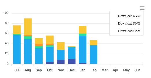
Chart Colours
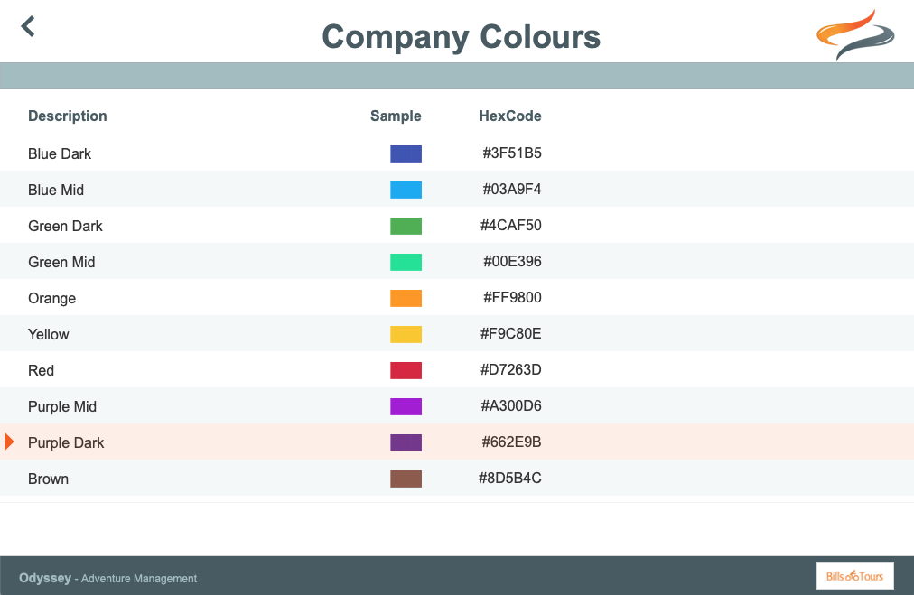
Odyssey offers the ability to match the charts colours to your company's brand colours.
This is particularly useful when using the Download as SVG or Download as PNG options as per above. Downloaded charts for use in other external documents, will match your brand colours.
Within: Administration | Settings | Company Settings - 1, there is an option to edit your Company Colours.
Clicking on a record will allow the HexColour code to be maintained. The colour sample will automatically display the correct colour, based on the HexCode that has been entered.
Once the Company colours have been entered, these can be assigned to the different Categories [L1], which are then used within the Charts.
These are maintained within: Administration | Settings | Company Settings - 2 | Categories [ L1 ]
Clicking on a Category will allow the Company Colour to be selected from the dropdown list.

Once the company colours are defined and assigned to Categories, all of the Dashboard charts throughout Odyssey will use these colours.