
Finance Dashboard
Dynamic charts offer an easy way to compare various aspects of a Season and the Bookings associated to it. Charts for up to 20 L1's (Categories, Trails, Companies) can be displayed.
They can be found from the Main Menu | Finance | Dashboard menu
Data Selections
Various selection options are available to tailor the data displayed in the charts.
Making any changes will refresh the charts instantly.

Departure Date vs Booking Date
This important radio button selection will define what dates all of the charts use.
- Departure Date - All records are selected based on the Start Date of the Departure they relate to.
- Booking Date - All records are selected based on the Date the Booking was made, regardless of the Season the booking relates to. It is a useful representation of when data entry tasks were required.
Chart Selections
There are two further data selections to make via drop down lists.
Records can be filtered by Departure Status from the first drop down list:

The season can be altered from the second drop down list:

Charts Explained
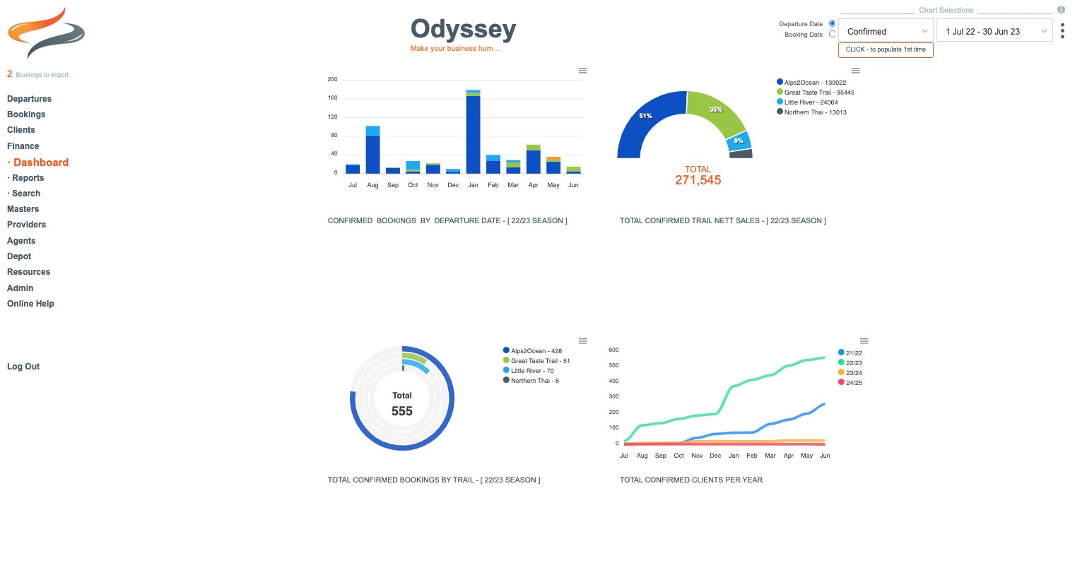
Monthly - Bar Chart (Bookings received)
This chart will display the monthly count of Bookings that match the 'Status' selection from the left dropdown list, that also match the timeframe selection from the righthand dropdown list. Hovering over any Bar will display the units and Trail/Category/Country. As you change the selections from the drop down lists, the titles on the chart change to reflect your choices.

Totals by Trail - Radial Chart
This circular chart displays a running total of all Bookings that match the 'Status' selection from the left dropdown list, that also match the timeframe selection from the righthand dropdown list. The legend also shows the count number for each Trail/Category/Country.

Total Trail Net Sales - Half Pie Chart
This half Donut chart displays the Percentages that each Trail/Category/Country's Nett Sales make up, from the total of all Net Sales for the timeframe selected. The legend also shows the Net Sales $ values for each Trail/Category/Country. The 'Total' is the Grand Total of all Net Sales that match the selections made.

Check it against the Finance Net Values report, learn more about it Here
TIP: If you find a discrepancy, you may find that you need to add together one or more Dashboard chart Booking Status values, such as FOC or ON HOLD, to get the corresponding report totals. :-)
Annual Clients - Line Chart
For each year a line shows the combined count of Clients throughout the Season. This chart does NOT refer to the Timeframe selected in the right hand dropdown list. But it will display values based on the left hand Status selected.

Additional options
Clicking on the small hamburger menu icon, will display some download options for each chart.
- Download SVG - This is an animated copy of the chart. Hovering over each bar will display the values and labels for each colour
- Download PNG - This is an image that can be inserted into other applications, eg: a Microsoft Word document, or report.
- Download CSV - This is the raw data as CSV, which can be opened in eg: Excel, showing separate columns of data, for further reporting.
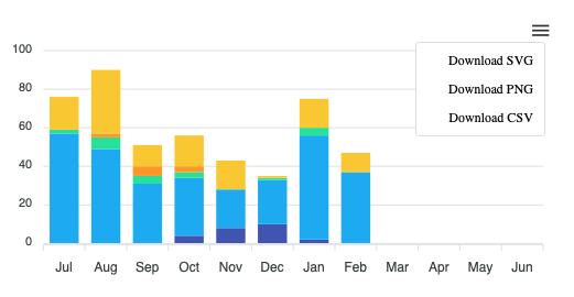
When these icons are displayed, they can be used to explore / or download smaller segments of chart data
Chart Colours
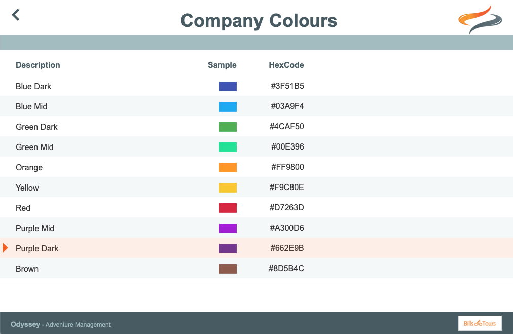
Odyssey offers the ability to match the charts colours to your company's brand colours.
This is particularly useful when using the Download as SVG or Download as PNG options as per above. Downloaded charts for use in other external documents, will match your brand colours.
Within: Administration | Settings | Company Settings - 1, there is an option to edit your Company Colours. Learn more Here
Clicking on a record will allow the HexColour code to be maintained. The colour sample will automatically display the correct colour, based on the HexCode that has been entered.
Once the Company colours have been entered, these can be assigned to the different Trails (Countries or Categories [L1]), which are then used within the Charts.
These are maintained from the Main Menu | Settings | Company Settings | Company Colours
Clicking on a Trail (Country or Category) will allow the Company Colour to be selected from the dropdown list.
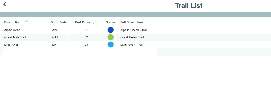
Once the company colours are defined and assigned to Categories, all of the Dashboard charts throughout Odyssey will use these colours.